If you ever wanted to see where I craft, head over to the lawnscaping blog, where I'm sharing my tiny and dark basement studio.
Here's a little peek for you:
Googly eyes and washi tape.
And yes, that is all the washi tape I own. sad.
And the little espresso cup? Ten years ago, Amar & I gave away espresso sets for our wedding favors. Now, one lonely cup houses buttons and tiny die-cuts.
Happy touring!
Friday, May 31, 2013
Wednesday, May 29, 2013
you are beautiful.
I am so happy to be rounding out day 25 of our 25 days of CSS inspiration! I hope you've enjoyed having the team show off new ideas and techniques every day for the last few weeks.
My project today is "no-stamps-required" and yes, it feels weird to have written that *grin*
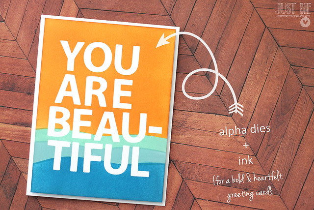
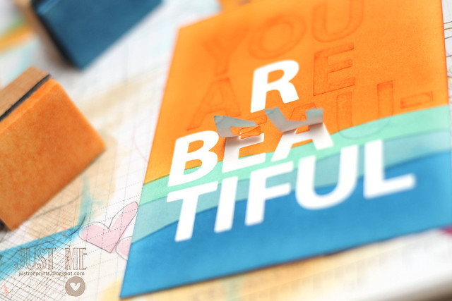
I die cut all of my letters out of masking paper and arranged them on a piece of white cardstock. I then used crudely cut strips of the masking paper to help me define the wavy lines of sponged colors. I worked my ink blending tools from top to bottom, orange to dark blue. In case there are curious minds out there, I did not use Distress Inks. As long as you are patient, work off some of the excess ink onto a scrap paper first, and use circular motions on your cardstock, you can use almost any ink and get smooth results.
Masking is so addictive. When you pull up the masks, the heavens open up and tiny little birdies start to sing.
You're hearing it right now, I know it.
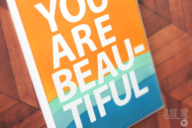
It's is the nearest thing to a print that this stampy gal could ever hope to create. In person, it is even more stunning and perfect looking.
Also, I should have taken a picture of my hands post-project. So ink-dirty that it's a wonder nothing got smudged...
♥.
My project today is "no-stamps-required" and yes, it feels weird to have written that *grin*

I die cut all of my letters out of masking paper and arranged them on a piece of white cardstock. I then used crudely cut strips of the masking paper to help me define the wavy lines of sponged colors. I worked my ink blending tools from top to bottom, orange to dark blue. In case there are curious minds out there, I did not use Distress Inks. As long as you are patient, work off some of the excess ink onto a scrap paper first, and use circular motions on your cardstock, you can use almost any ink and get smooth results.
Masking is so addictive. When you pull up the masks, the heavens open up and tiny little birdies start to sing.

You're hearing it right now, I know it.

It's is the nearest thing to a print that this stampy gal could ever hope to create. In person, it is even more stunning and perfect looking.
Also, I should have taken a picture of my hands post-project. So ink-dirty that it's a wonder nothing got smudged...
♥.
Tuesday, May 28, 2013
Ballerina birthday tags
When I don't have stamps to match a party theme, I pretty much smooch my silhouette in humble thanks. A dollar ballerina file is all it took to create these cute tags:

I used a tag shape I already owned, and cut the silhouette file out of masking paper. I don't love handmade decorations to look too matchy-matchy (doesn't that defeat the point of handmade?) so I used both the positive and negative parts of the ballerina cuts to sponge my tags. A flourishy sentiment (a mix of *you* and *thank...for coming* sentiment) and a few sequins finished things off.
Which version is your favorite? pink ballerina on white tag, or white ballerina on pink tag?
And, a simple silhouette file can be used for more than just favor tags:

Cut out of 12x12 inch cardstock, they can beautiful hold up either end of a banner ♥.

I used a tag shape I already owned, and cut the silhouette file out of masking paper. I don't love handmade decorations to look too matchy-matchy (doesn't that defeat the point of handmade?) so I used both the positive and negative parts of the ballerina cuts to sponge my tags. A flourishy sentiment (a mix of *you* and *thank...for coming* sentiment) and a few sequins finished things off.
Which version is your favorite? pink ballerina on white tag, or white ballerina on pink tag?
And, a simple silhouette file can be used for more than just favor tags:

Cut out of 12x12 inch cardstock, they can beautiful hold up either end of a banner ♥.
Saturday, May 25, 2013
soft and stitched thank you.
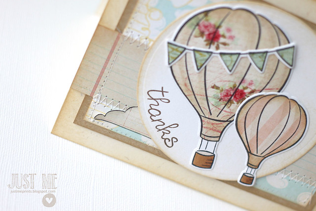
I have a card on the lawn fawn blog this morning.
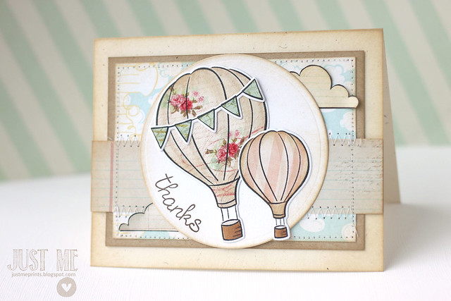
I used the hot air balloon die-cuts, but also paper-pieced the images. I love the white border around the images, and wanted to keep that, even if I was doing a lot of hand-cutting...
The card was created for the memorial day OWH blog hop. The information and links are on the lawn fawn blog!
Tuesday, May 21, 2013
you need cake to make it a party.
Welcome back to another day of CSS inspiration!
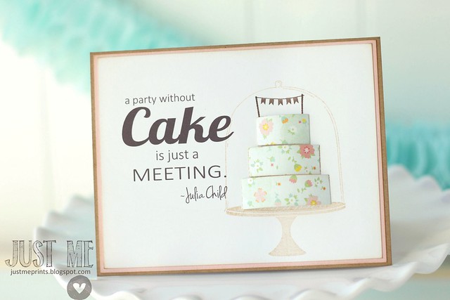
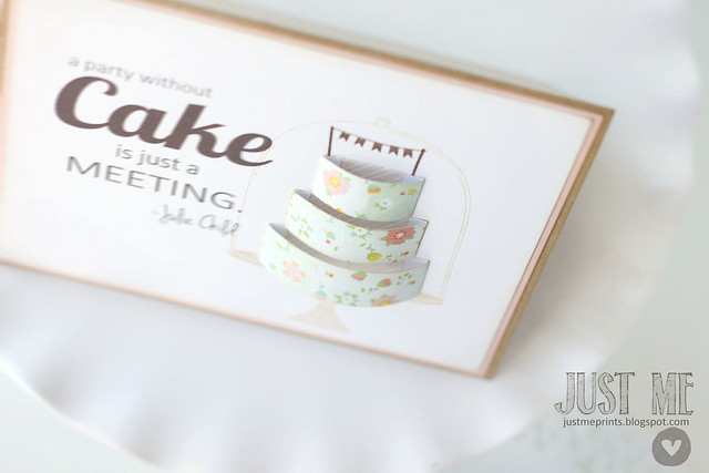
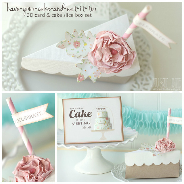
With just a few strips of patterned paper, I easily created a fun, 3-D cake image.
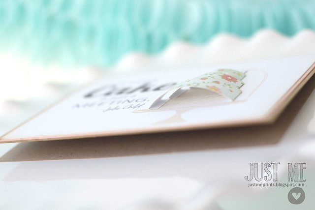
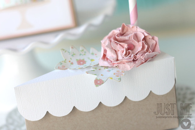

I came across this quote by Julia Child and just had to create a whole card & gift box set inspired by it:
"a party without CAKE is just a meeting."
I'm obviously mourning the loss of party season in our home, and with no excuse for baking a cake, I turned my attentions to the paper kind.

The cake decorating and cake dome sets were perfect for highlighting the sentiment that I created and printed on the computer. But a flat cake would have been so boring...

With just a few strips of patterned paper, I easily created a fun, 3-D cake image.

Here's a close look at the folded tabs that hold it all down.

And what's a birthday without a slice of cake box? (a meeting, apparently.) The birthday gift could easily be tucked inside for a very fun set. I used leafy dies (in the same patterned paper as the 3-d card cake) and created a soft flower by following my own tutorial. (grin.) I used build-a-flower dies and *this technique* to get 'er done.

yum!
Monday, May 20, 2013
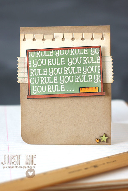
you rule! {lawnscaping challenge no. 58}
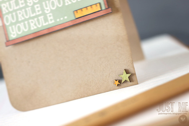
Good monday morning! It's time for another lawnscaping challenge - and this one was a challenge for me: create a CAS project (that's clean-and-simple, if you stumbled onto my card-making blog from out of nowhere...)
this is what clean and simple looks like for me:
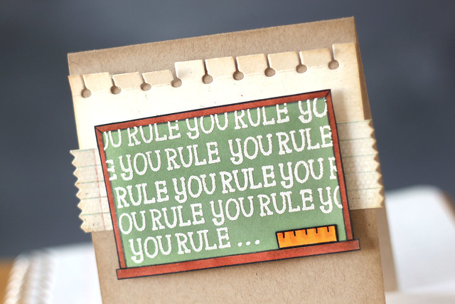
I created a focal point out of the chalkboard, added some notebook patterned paper and notebook-edged cardstock in behind, and just a few wood veneer stars to balance things out.
Apart from the ruler, the chalkboard is all one-layer. I just find it looks cleaner that way. I colored in the frame with copic markers, and masked it to sponge in some green distress inks. The sentiment was stamped inside the frame more than a few times, and heat embossed.
I hope you like it and decide to put up your own entry! You could win a prize from lawn fawn:
Have a great day ♥.
Saturday, May 18, 2013
you're the best {saturday creations}
I still don't have the newest Precious Remembrance set, but that doesn't mean I can't provide a little inspiration with some of our older sets.
I used "positive thoughts" and "mom & dad", along with some lawn fawn speech bubbles to create this fun little card.
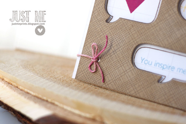
I hope you like it!
I used "positive thoughts" and "mom & dad", along with some lawn fawn speech bubbles to create this fun little card.
True story: I actually created this card for the 10 minute craft dash this week, but ran into two problems.
- it took me closer to 30 minutes to get this one done, and
- i should have looked up the color palette before I got started. making a card in 10 minutes in hard enough! it should just be a free-for-all every time *wink*
Sooo, I made another card for the dash (you saw it *here*) and I'm sharing this one today.

I hope you like it!
Friday, May 17, 2013
some housekeeping....
If you follow me on facebook, you've already heard this bit of news, but I wanted to share it here as well:
This camping party, that my sister and I put together for my nephew's birthday, is being featured on Good Housekeeping's website, as part of a summer party themes slideshow. As much as I love getting recognition for my cards, having a party featured on GH.com feels so amazing...
Click *here* to check out the entire slideshow. There are some great ideas in that slideshow, to help you be the hostess with the mostess this summer!
Click *here* to check out the entire slideshow. There are some great ideas in that slideshow, to help you be the hostess with the mostess this summer!
Wednesday, May 15, 2013
10 minute craft dash with Precious Remembrance.
how's that for a fancy title.
The Precious Remembrance team is joining Paulina for this week's 10 minute craft dash! I have to admit that this was my hardest one. I never work with lavender and Precious Remembrance is more sentiment than image oriented. Apparently, in a time crunch, I rely on cute smiley faces to make my card look more impressive than it really is ;)
The rest of the team will be showing off the new PR set, "little one." My international mailing saga has taken a turn: the package was apparently re-routed to somewhere in Chicago by the Canadian customs department. Don't ask. I have no idea.
Here's how I spent my 10 minutes:
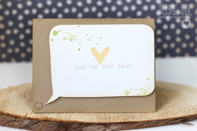
minutes 1-2: immediately turned on my silhouette, selected a speech bubble shape from my library and set it to cut. In the meantime, I gathered my PR stamps: positive thoughts and mom & dad.
minutes 3-5: stamped the heart in yellow, the sentiment in purple, and the splotches in green. color combo success. I sponged around the edges.
minutes 6-7: created a folded card base, sponged around the card edges, and rummaged through my stamps for that little lawn fawn smiley. Apparently, I still needed a smiley face, and even the tiniest one would do.
minute 8: stamped it in the bottom left corner.
I ended with a time of 8 minutes and 4 seconds. No fuss, no muss. My quickest dash time ever!
Precious Remembrance is sponsoring this week's dash - click *here* to sweat your way to a 10 minute card.
The Precious Remembrance team is joining Paulina for this week's 10 minute craft dash! I have to admit that this was my hardest one. I never work with lavender and Precious Remembrance is more sentiment than image oriented. Apparently, in a time crunch, I rely on cute smiley faces to make my card look more impressive than it really is ;)

The rest of the team will be showing off the new PR set, "little one." My international mailing saga has taken a turn: the package was apparently re-routed to somewhere in Chicago by the Canadian customs department. Don't ask. I have no idea.
Here's how I spent my 10 minutes:
minutes 1-2: immediately turned on my silhouette, selected a speech bubble shape from my library and set it to cut. In the meantime, I gathered my PR stamps: positive thoughts and mom & dad.
minutes 3-5: stamped the heart in yellow, the sentiment in purple, and the splotches in green. color combo success. I sponged around the edges.
minutes 6-7: created a folded card base, sponged around the card edges, and rummaged through my stamps for that little lawn fawn smiley. Apparently, I still needed a smiley face, and even the tiniest one would do.
minute 8: stamped it in the bottom left corner.
I ended with a time of 8 minutes and 4 seconds. No fuss, no muss. My quickest dash time ever!
Precious Remembrance is sponsoring this week's dash - click *here* to sweat your way to a 10 minute card.
Tuesday, May 14, 2013
glitter and thanks.
welcome to another day of Clear and Simple Stamps inspiration!
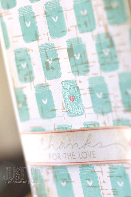
Awhile back, CSS hosted a "spread the love campaign" and today, I'm using the Limited Edition: Spread the Love stamp set (not for sale) that was a bonus set for those who purchased from their swag bag gift. The stamp says "thanks for the love" with a little jar attached to it.

The only problem: I wanted to use the jar.... by itself. It's just so cute!
So true story: a little stamp surgery never hurt anyone. By cutting the jar away from the sentiment, I suddenly had many more options for my card design. Do you do that with your stamps? I'm pretty sure most of my "happy birthday" sentiments are cut in half - I like side-by-side as well as stackable stamping options, hee.
To create my patterned paper, I stamped the jar repeatedly into rows, and then stamped the distressed linen background over-top. Just for fun, I colored in one jar's heart and glittered it up with diamond stickles.

I gave the sentiment flag a bit of a wave by placing a foam square under the "t" for "thanks" and a glue dot at the other end. I think it's a fun way to make sure that the banner keeps the shape that I want it to have.
I hope you like it! If you'd like to see a different take on the same card, download the CSS app today!
Awhile back, CSS hosted a "spread the love campaign" and today, I'm using the Limited Edition: Spread the Love stamp set (not for sale) that was a bonus set for those who purchased from their swag bag gift. The stamp says "thanks for the love" with a little jar attached to it.

The only problem: I wanted to use the jar.... by itself. It's just so cute!
So true story: a little stamp surgery never hurt anyone. By cutting the jar away from the sentiment, I suddenly had many more options for my card design. Do you do that with your stamps? I'm pretty sure most of my "happy birthday" sentiments are cut in half - I like side-by-side as well as stackable stamping options, hee.
To create my patterned paper, I stamped the jar repeatedly into rows, and then stamped the distressed linen background over-top. Just for fun, I colored in one jar's heart and glittered it up with diamond stickles.

I gave the sentiment flag a bit of a wave by placing a foam square under the "t" for "thanks" and a glue dot at the other end. I think it's a fun way to make sure that the banner keeps the shape that I want it to have.
I hope you like it! If you'd like to see a different take on the same card, download the CSS app today!
Saturday, May 11, 2013
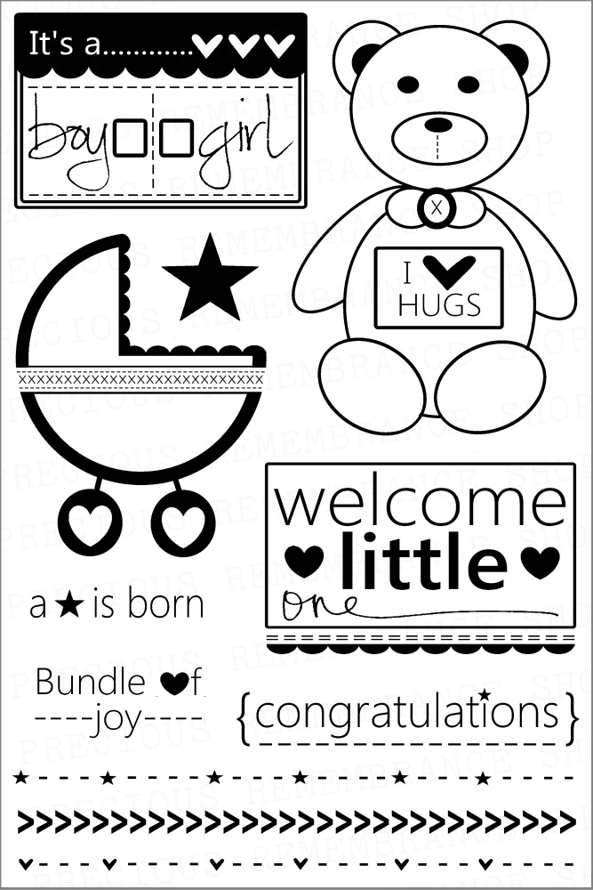
Little one {precious remembrance new release}
Hi peeps!
International shipping sucks. I am still waiting on my sweet "little one" set from Precious Remembrance, but check it out:
International shipping sucks. I am still waiting on my sweet "little one" set from Precious Remembrance, but check it out:
Isn't it cute? I can't wait to play around with it!
Fingers crossed that it comes in time for next week's Saturday Creations post.
In the meantime, check out the blog for inspiration from the rest of the design team!
Friday, May 10, 2013
This party is epoch!
haha. just a little dino humor to start your Friday.

My friend Marlyn, from Montreal Confections threw a dinosaur-themed birthday party for her son Ryan. I was so pleased to be able to make a few decorations for the event.
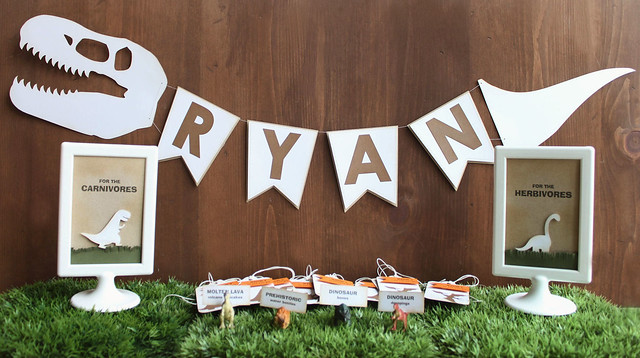
The banner is my fave. I used a silhouette file for the head and the tail (I cropped the tail off of one of them and only cut that part out) and CSS banner and alpha dies for the dino "body."
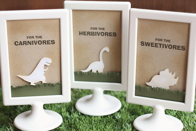
I love how these table signs turned out! I used the silhouette to cut out a variety of dinosaur shapes, and printed the titles on my computer. Those 1$ Ikea frames are awesome.
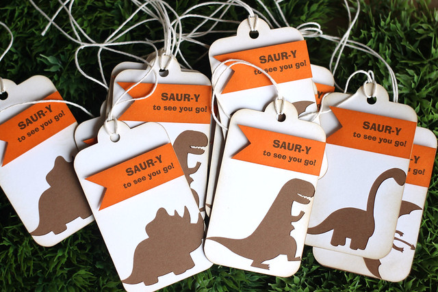
When I cut the dinosaur shapes for the frames, I actually used the negative portions for the favor tags. I cut out two tag shapes (one in white, with the dinosaur cut into it, and another in brown.)

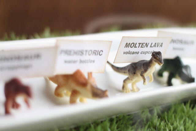
I found these tiny dinosaurs at the dollar store - they come in packs of 10, I think. I used my exacto knife to slice a slit into the dino top and slid the food label into it. Perfect, no?
NOW. You have to, have got to, absolutely, click over to Marlyn's blog and just take a peek at the cake she made for this epoch party (groan.) There are also fossil cupcakes, but honestly - that cake takes the cake. She has full tutorials available if you would be interested to re-create it. I am in complete awe of Marlyn's talents, and watched the videos with my jaw on the floor.
Happy dino hunting (or, whatever else you actually plan on doing today!)

My friend Marlyn, from Montreal Confections threw a dinosaur-themed birthday party for her son Ryan. I was so pleased to be able to make a few decorations for the event.

The banner is my fave. I used a silhouette file for the head and the tail (I cropped the tail off of one of them and only cut that part out) and CSS banner and alpha dies for the dino "body."

I love how these table signs turned out! I used the silhouette to cut out a variety of dinosaur shapes, and printed the titles on my computer. Those 1$ Ikea frames are awesome.

When I cut the dinosaur shapes for the frames, I actually used the negative portions for the favor tags. I cut out two tag shapes (one in white, with the dinosaur cut into it, and another in brown.)

I found these tiny dinosaurs at the dollar store - they come in packs of 10, I think. I used my exacto knife to slice a slit into the dino top and slid the food label into it. Perfect, no?
NOW. You have to, have got to, absolutely, click over to Marlyn's blog and just take a peek at the cake she made for this epoch party (groan.) There are also fossil cupcakes, but honestly - that cake takes the cake. She has full tutorials available if you would be interested to re-create it. I am in complete awe of Marlyn's talents, and watched the videos with my jaw on the floor.

Happy dino hunting (or, whatever else you actually plan on doing today!)
Wednesday, May 8, 2013
hot dog!
It's the last day of lawn fawn inspiration! "Critters in the dog park" is such a cute set! And it comes with matching dies!

For my card, I created a scene with one of the dogs (I am so not a dog person. I have no idea what breed any of the dogs in this set are, but I think they are adorable!) and put him into a fanciful frame. People hang paintings of their pets on their walls, right? boldly striped walls, right?
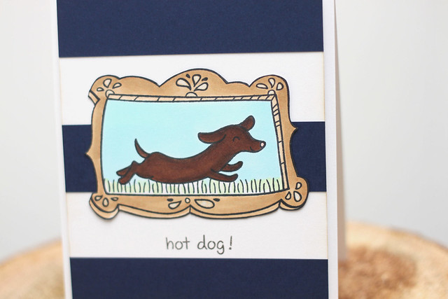
hot dog!

For my card, I created a scene with one of the dogs (I am so not a dog person. I have no idea what breed any of the dogs in this set are, but I think they are adorable!) and put him into a fanciful frame. People hang paintings of their pets on their walls, right? boldly striped walls, right?

hot dog!
Tuesday, May 7, 2013
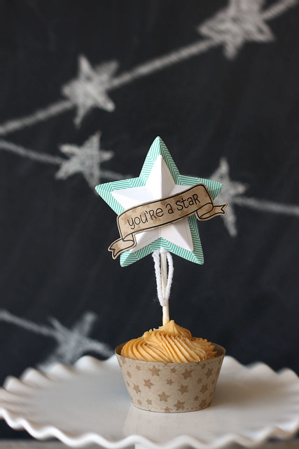
you're a star!
*** this is my second post of the day! scroll down or click {here} for my CSS teacher appreciation project***
Welcome back to another day of lawn fawn inspiration! We're showing off "lucky stars" - a new 3x4 stamp set, and a set of lawn cuts dies- stackable puffy stars! I puffy heart these puffy stars!
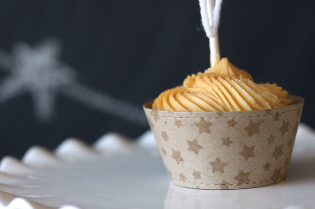
The stars from "lucky stars" make for a great pattern! I decorated a kraft cupcake liner (cut with this die) to match the topper.

Did you know that you can turn any star into a 5 point star? I made two of them, and nested them together. So fun! As an added bonus, the sentiment fits perfectly into the little banner.
I hope you like what I've made - check out the lawn fawn blog for even more!
Welcome back to another day of lawn fawn inspiration! We're showing off "lucky stars" - a new 3x4 stamp set, and a set of lawn cuts dies- stackable puffy stars! I puffy heart these puffy stars!
If someone is a star around our house, that deserves a treat.

The stars from "lucky stars" make for a great pattern! I decorated a kraft cupcake liner (cut with this die) to match the topper.

Did you know that you can turn any star into a 5 point star? I made two of them, and nested them together. So fun! As an added bonus, the sentiment fits perfectly into the little banner.
I hope you like what I've made - check out the lawn fawn blog for even more!
sorry I'm overdue {25 days of CSS inspiration}
CSS is doing things a little differently this month! It's been three years since the CSS daily app first made an appearance on the crafting scene. Each day the app features a new project, complete with instructions and photos. You can save to your favorites for quick reference, and search through past months for even more inspiration.
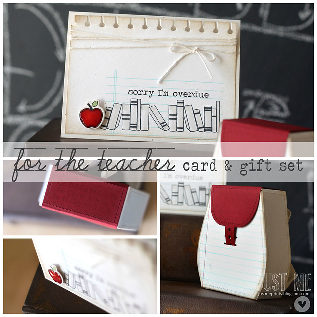
Since it is teacher appreciation week, I automatically reached for school-themed images and dies. But, if you're like me, you might have the best intentions and none of the follow-through. This is a great project to give your child's teacher, even if you can't manage to get to it until next week *wink*
I printed the card sentiment via computer (the font I used is called traveling typewriter) and paired it with images from airmail, and that perfect apple. The notebook edge die worked perfectly to accent the top of the card. And, of course, a glossy apple. I can't help it. I stamp an apple and I just have to gloss it up.
To match the card, I created a little backpack - it can be filled with treats, a gift card, or tiny notecards. I stamped the same notebook page image on the front of the backpack, and brought in some alpha love on the red accent piece.
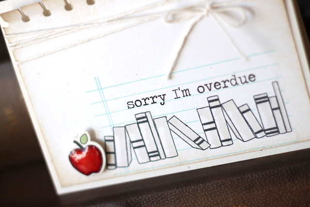
Moral of the story: better late than never. hee.
In celebration of the CSS daily app, we are giving you 25 days of inspiration. Each day, a DT member will bring you a fun new project, and as an added bonus, will showcase a coordinating project on the app. yay!

Since it is teacher appreciation week, I automatically reached for school-themed images and dies. But, if you're like me, you might have the best intentions and none of the follow-through. This is a great project to give your child's teacher, even if you can't manage to get to it until next week *wink*
I printed the card sentiment via computer (the font I used is called traveling typewriter) and paired it with images from airmail, and that perfect apple. The notebook edge die worked perfectly to accent the top of the card. And, of course, a glossy apple. I can't help it. I stamp an apple and I just have to gloss it up.
To match the card, I created a little backpack - it can be filled with treats, a gift card, or tiny notecards. I stamped the same notebook page image on the front of the backpack, and brought in some alpha love on the red accent piece.

Moral of the story: better late than never. hee.
Monday, May 6, 2013
a small, crittery gang {mama elephant guest designer}
****this is my third and final post of the day! Scroll down to see what else is new today****
I'm back with Mama Elephant to show off my cards made with the new "tree friends" set.
When Kryssi first emailed the images of the upcoming sets, I squealed a little when I saw this one. It's right up my alley, being so cute 'n all... I already used it for my stampede day project, but I wanted to try a few different things for this post.
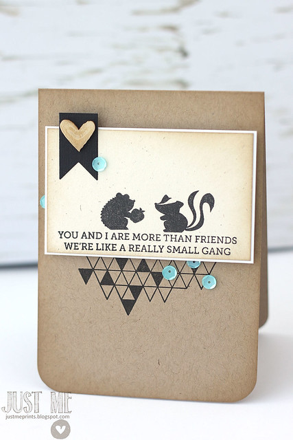
I can't even tell you how much I love this card. That sentiment still makes me giggle.
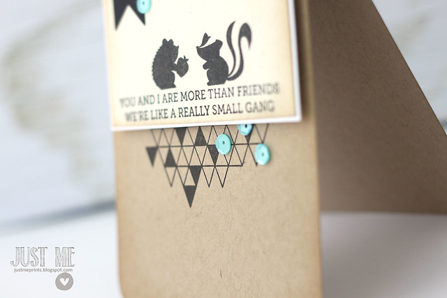
I paired it with a fun triangle border, added some sequins and a wood veneer heart, and snickered at it some more.
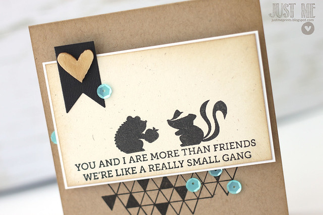
I mean, c'mon - he's offering his friend an apple. I die.
My next card is completely different:
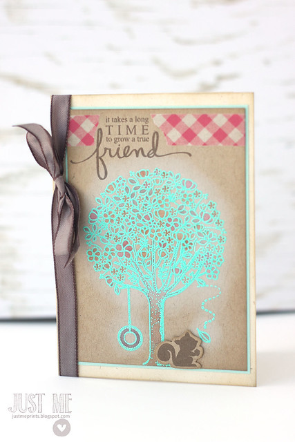
I stamped and cut out the little squirrel separately, so that I could add him over-top.
I love this sentiment - it is such a sweet saying, and the fonts are fantastic. I know I'll be reaching for it quite a bit. I accented the sentiment with some roughly-torn washi tape, and added a ribbon to the side of my card.
I hope you like what I've created with this set!
♥.
I'm back with Mama Elephant to show off my cards made with the new "tree friends" set.
When Kryssi first emailed the images of the upcoming sets, I squealed a little when I saw this one. It's right up my alley, being so cute 'n all... I already used it for my stampede day project, but I wanted to try a few different things for this post.
I can't even tell you how much I love this card. That sentiment still makes me giggle.

I paired it with a fun triangle border, added some sequins and a wood veneer heart, and snickered at it some more.

I mean, c'mon - he's offering his friend an apple. I die.
My next card is completely different:
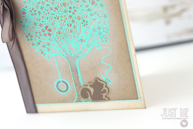
I embossed the tree with some zing aqua embossing powder, and then dabbed in some color here and there with copic markers.

I stamped and cut out the little squirrel separately, so that I could add him over-top.

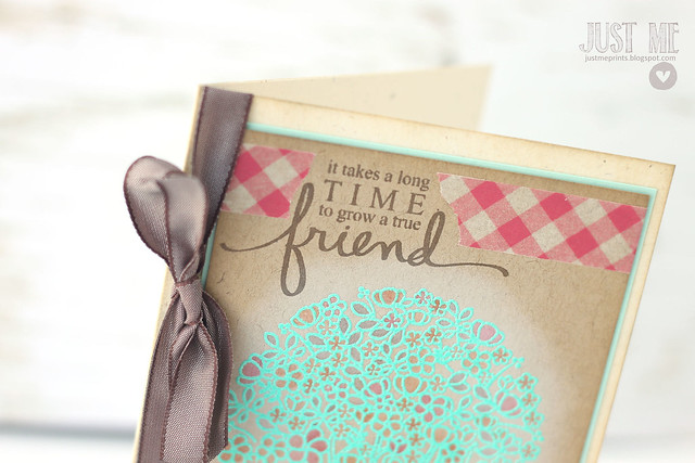
I love this sentiment - it is such a sweet saying, and the fonts are fantastic. I know I'll be reaching for it quite a bit. I accented the sentiment with some roughly-torn washi tape, and added a ribbon to the side of my card.
I hope you like what I've created with this set!
♥.
Subscribe to:
Comments (Atom)


Day25.jpg)
Day17.jpg)



Day10.jpg)
-AppSneak.jpg)
