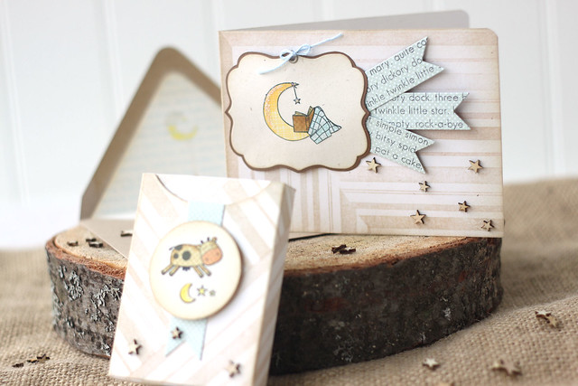
The entire CSS design team is showing off projects made with our favorite CSS products. Sweet dreams is the set that made me fall in love with CSS stamps. I couldn't help but mix it up with my favorite dies for a little baby ensemble.
It was so hard to narrow down my fave CSS products! But here's what I came up with:
The favor flags were stamped with the nursery rhyme text border, and I gave the card-base a stripey look.
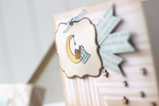
For the main image, I die-cut the label die (also tracing around the die and hand-cutting a brown mat for it) and stamped the sleepy moon image onto the label. I love a book-wormy-moon. I paper-pieced the images (I love the soft texture that you can get with monochromatic papers), and added some fun glitter touches to the moon. I don't think you can tell in the pictures, but I added a foam square to the middle of the label, and then firmly glued the outline of the label to the card base. It gives a bit of texture and dimension without having it stand out too much!
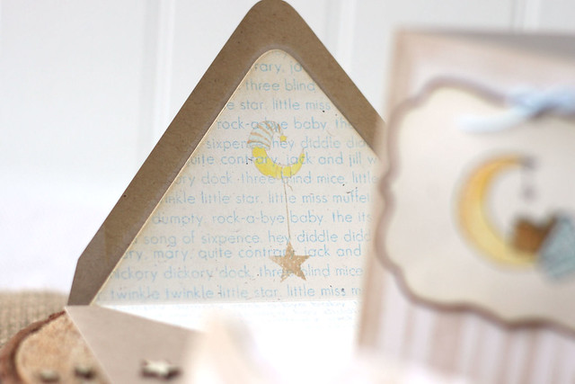
Ever since CSS came out with their envelopes and matching liner die, I don't think a card is complete with a matching envie. I stamped the liner with the nursery rhymes, and then stamped the moon in a very soft brown ink directly over-top. Look, ma - no masking. ha. I very carefully dabbed some copic color into the moon image, being careful not to smudge the (non-memento) brown ink in the process.
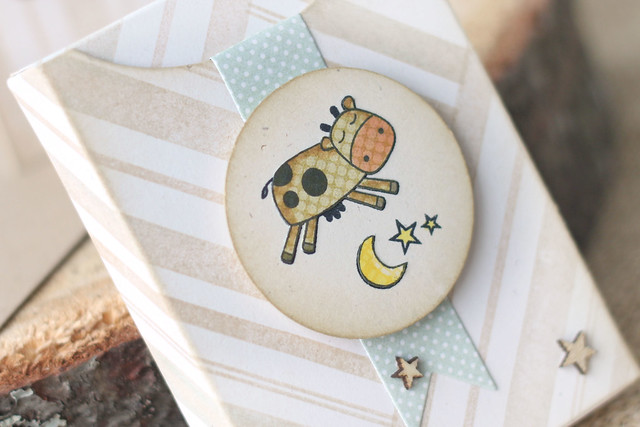
What's a baby card without a baby gift? I whipped up a little gift box using my favorite CSS favor die - and that's saying a lot, since CSS carries so many different options! I stamped the box in the same stripes as the card, and included a matching favor flag.
I paper-pieced the cow-jumping-over-the-moon. Isn't he the cutest? (designer tip: adding a tiny bit of copic coloring is a fun way to dress up your patterned paper...)
I hope you like my baby-themed CSS faves!
The rest of the DT is showing off as well:














![[image] [image]](http://i1290.photobucket.com/albums/b526/mamaelephant/GRAPHICS/APRIL_zps88aa7f5e.png)
