
Hey there!
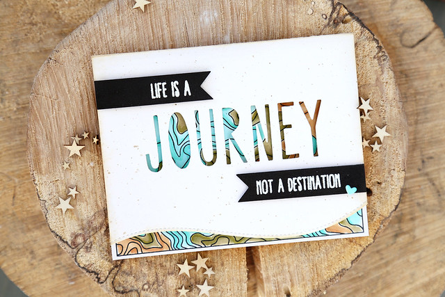
It's day 2 of this month's Neat and Tangled release week and we're all showing off Topography, illustrated by Miriam Prantner. It features a great background, large enough to cover the front of a card, and a slew of travel-themed sentiments.
I opted to die-cut the word J-O-U-R-N-E-Y using the same alphas as I used on yesterday's card. Pretty sure I like 'em.
You could already see a sneak of the topography map, through the letters.
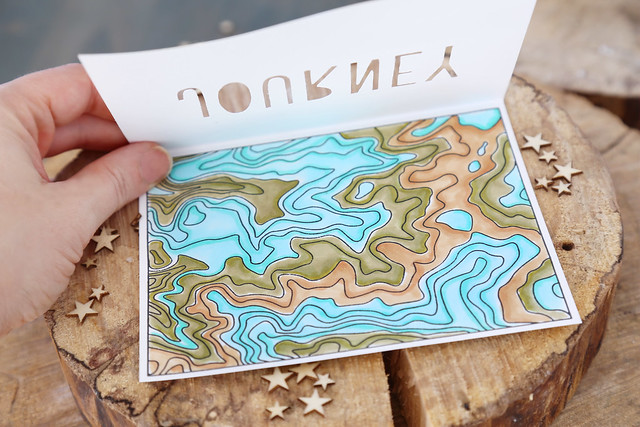
When you open it up, you get the full view. It was fun to loosely color everything in with copics! If copics aren't your thing, this map would look fantastic in watercolor.
I hope you like it! There's more to see on the NT blog this morning - click!
♥.
It's day 2 of this month's Neat and Tangled release week and we're all showing off Topography, illustrated by Miriam Prantner. It features a great background, large enough to cover the front of a card, and a slew of travel-themed sentiments.
I opted to die-cut the word J-O-U-R-N-E-Y using the same alphas as I used on yesterday's card. Pretty sure I like 'em.
You could already see a sneak of the topography map, through the letters.
When you open it up, you get the full view. It was fun to loosely color everything in with copics! If copics aren't your thing, this map would look fantastic in watercolor.
I hope you like it! There's more to see on the NT blog this morning - click!
♥.
I love how you layered a stencil piece over the map... Looks fabulous
ReplyDeleteThis is such a unique design! I love how the beautiful background peeks through the letters :)
ReplyDeleteGorgeous card and fun effect!
ReplyDeleteVery cool--I like how you get a sneak peak of the topography map through the letters.
ReplyDeleteI'm really loving this stamp set. All the samples are so inspirational
ReplyDeleteWhat a super fun design! And I love the colors you used. Perfect.
ReplyDeleteAwesome card! Love the map peeking through the die-cut letters. Beautiful colors!
ReplyDeleteGreat card! Love how you did the cut out over the background! Love all the creative ideas from these design team members. So much talent, thanks for sharing!
ReplyDeleteI so love how this turned out! The negative cut alphas are genius!
ReplyDeleteAmazing card...love your negative die cuts!
ReplyDeleteWhat a pretty card. Great coloring.
ReplyDeleteI love your card Elena, very pretty!
ReplyDeleteLove the background design showing through the negative die cut letters! Awesome card with a beautiful color combo! Love this versatile stamp set!
ReplyDeleteYou colored this more like an actual topography map! I love it!
ReplyDeleteWow! Wow! Wow! Awesome card!!!
ReplyDeleteLove how the background stamp peeks thought the negative space on the letter dies.
ReplyDeleteLove it. I have the Alpha dies. I could do something like this! Thanks for the inspiration. Love the colours of the background.
ReplyDeleteFabulous showcase of both the Topography image and the alphas!
ReplyDelete~carol
Stunning card!!! I love how you colored the background layer. And the die cut word is just amazing over the top!!
ReplyDeleteI absolutely love the way you did this card. The cut out Journey really catches your eye with the colors and design showing through!
ReplyDeleteI love the cut out on the front. It really pulls the eye in with the topographic map behind it.
ReplyDeletesuperb work!! love it
ReplyDeletecheers
preety
I love how you've shown off the Topography stamp through the die cut word!
ReplyDeleteThat is awesome!! Love the topo-map and the negative die-cut is perfect to put over that.
ReplyDelete