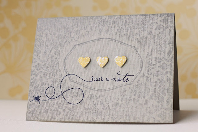
I started an online card class on Monday, and I'm playing catch-up. I've just had time to watch the day 1 video and was inspired to create my version of Kristina's card:
I started with a textured piece of SU's sahara sand cardstock. Once scored, I placed a die-cut of a mat-stack 1 shape in the middle (cut out of masking paper so it sticks down completely!) I then stamped the entire card-front with Marketstreet's vintage wallpaper background in a light grey ink. When I removed the mask, I was able to stamp the frame from PTI's mat stack 1 set right into the opening. I like how there is some space between the frame and where the design starts, but if I didn't like that, I simply had to cut out my mat stack 1 image (instead of using the die-cut, which is slightly bigger.) I think I like my way better because it saves cutting time :)
I sponged around the entire card-front in the same light grey ink, and then stamped the greeting (from Happy Trails) into the focal frame. The swirl and ink blot are images from the same set.
I stamped the same vintage wallpaper background on a sheet of white paper in a yellow ink, and the die-cut 3 tiny hearts (from PTI's heart prints dies). They were popped up on foam squares.
Thanks for looking!


I love what you did with this card. Gorgeous. I've started the course too but you don't look as though you need it!
ReplyDeleteI love your masking and the frame you were able to place in the masking area. Beautiful card!
ReplyDeleteOh, you are obviously feeling much better. This card is just super.
ReplyDeleteOh, wow, this is so pretty, Elena! I love it!
ReplyDeleteGlad to hear you're feeling better.
so pretty! the masking looks perfect!
ReplyDeleteSo pretty! That is a fabulous way of masking and still getting the frame effect. Will have to try that for sure!
ReplyDeleteThis is so pretty!! I love those three little hearts!
ReplyDeleteGoodness Elena...I'm not a usual commenter, but I just had to stop by and comment on this stunner of a CAS card. Love the muted colours and you've captured Kristina's sample perfectly with your own flavour. xx
ReplyDeleteJust Great!! ... i love it!
ReplyDeleteSimple and Elegant. It's one of those that you can't help but do a double take on. Very nice!
ReplyDeleteI love the gray and yellow color scheme you have really captured a clean and simple but elegant card...super!
ReplyDeleteclean and simple but oh so beautiful!
ReplyDeleteyes! Simple and beautiful! I love this one. Love the grey.
ReplyDeleteVery pretty!
ReplyDeleteGorgeous!
ReplyDeleteabsolutely gorgeous!
ReplyDeleteThis is beautiful!
ReplyDeleteTotally beautiful xx
ReplyDelete